Friday, 16 October 2015

750 Word analysis - 'Narcos'

Narcos Gustavo's death(Spoiler Alert)
Narcos IMDB

Narcos: A chronicled look at the criminal exploits of Colombian drug lord Pablo Escobar.

At the beginning of the clip the protagonist Gustavo is captured in a close up with his head tilted up high and his eyes shut. The lighting on this clip is very poorly lit - mostly back lighting - covering the whole entire right side of his face with plenty of light covering the left side of his face. On top of this there was blood dripping down from his nose and cheeks which suggest that he has been badly beaten during the night. A speculator () suggested that the director tried to capture Gustavo as Jesus Christ as there is many similarities to his death.
This could lead to the audience thinking he could of been previously been kidnapped the night before and is being interrogated in the early morning. Because of this the audience are forced to be on the edge of the seat because he is portrayed as mostly the villain throughout but still seen as the helper to some (Providing to the families Allegedly*)but most are rooting for him because he has come to terms with his death.

In the next scene (0.58) the audience are seeing a power struggle between the two characters as the lighting sun light (Side lighting from the left) and the sun it’s self-rises from the left over to the night during the day. This shows the beginning of a day. (This scene was also speculated to be very similar to the Bible as he didn't want to confess to the man where his cousin is. In the Bible Judas a former saint (as I recall*) ratted out Jesus which lead to his death.) This is the act of turning a new leaf or to / cleans the day.  This follows the narrative theory of linear patterns. This lead to the audience feeling emotional and sympathetic towards Gustavo as the lighting has foreshadowed his death is soon to come and we, the audience and Gustavo are trying to soak it in. This shows the audience that the multi strand narrative is coming to conclusion.

Following on from this scene Gustavo, The New Hero - (to some) because he never ratted out his family - has performed an action code as he has asked his interrogator the incorrect question / the question he wasn't looking for. The dietetic music of a Mexican string guitar over him aggressively but carefully talking to the new villain suggests that there is a rebellion against the person who is in power. However, Gustavo does not say his name as he doesn't respect him. This is because as Banditos they do not address their enemies by name as they consider them to be 'mierda' - which is Spanish for 'shit'. At this moment the people who are representing Gustavo are feeling better about his previous understanding to the fact he was going to die as he is doing what a true Banditos would do and rebel against their enemies. To add on to this the people who are not supporting Gustavo are feeling shocked as they thought that he would of done what they think in their own eyes as the right thing.

Throughout this scene Gustavo and his apparent kidnapper whose identity is unknown has been letting Gustavo share his cigarette. Gustavo attempts to take a long pull and was snatched out of his hand representing Gustavo has lost all of his power. Gustavo then exhales as he is getting angry as he can’t have it his way – like a stroppy child - which makes felt audience lead on as he wants to do something by creating an enigma code which is pointless as he has lost the power struggle. Due to being held up the night before.

To conclude, the end of the clip Gustavo can be seen cursing at his kidnappers with non-diegetic music playing in the background. He is captured in a close up which has previously been a long shot but was zoomed in to fit the scene. After this there is a jump shot straight to him lying dead on the floor with blood pouring down his face. This makes the audience feel flabbergasted as they didn’t expect it so soon.
Wednesday, 14 October 2015

Cinematography:

(Update add to original when at home***************


The movie I have picked is Casino Royale.  
The opening scene features the protagonist James Bond (Daniel Craig) bending over to retrieve his gun. The camera is located from behind him at mid waist level and is capturing a long shot. The shot is only seen for a few seconds until it jumps to a man on the floor aiming a gun at him. This shot was filmed as a medium shot. After this has been displayed the camera then jumps back to Bond its Iconic Gun barrel sequence with James Bond appearing out of the circle As you can see from the video Bond is also still captured in a long shot. All throughout this, the camera does not move and is not connected to a tracker.

Following this shot, the camera then zooms out on Bond and enters the gun barrel sequence. This then shortly follows up into the iconic Blood dripping from the top going down wards dissolving into the screen becoming red. Once the camera is fully soaked in what is now a dark red, the credits and the names of the creators appear.

Once the name of the protagonist has disappeared the camera is then full of Shapes of playing cards, a vibrant spades and a black club appearing from the center of the screen. This is related to the theme and title of this movie - CASINO Royale.

Wednesday, 7 October 2015

Feedback and review of presentations.

My Presentation could of been better if I made a power point and uploaded it to Google drive. However, I did not do this and instead print screened the word document and uploaded it to my blog. Although this was still accepted it isn't how I wanted to do it and therefore that is one thing I would like to change if I could. Not only this, I realised as I was doing my presentation that I had accidentally put one of the pictures on to the other slide and had to blag my way through it. Although it made sense its not how I would of liked it to go and therefore I am disappointed.

Feedback on my presentation from Mandev:

"Secondly, I chose Luke because I think that the pictures that he used were the strongest and the way he thought of the meanings for each picture were quite original; I don't think anyone watching his presentation thought why he chose those particular pictures, which made it even more better because it made us, the audience, think."

Sunny's presentation was far the best because he went the extra mile like a A level student should. He went the extra mile and took a picture of the photo himself. By doing this, he was able to show the presentation through his eyes making him show himself as ready for the coursework in January.

Friday, 2 October 2015

Sound Task:

Straight Outta Compton:

By using the songs they use in the movie and in real life, creates a synergy between the film and the movie. This will make the audience think the song and the movie are alike or as the rappers themselves would put it "Aint Sh!t Changed". This is heavily the theme throughout the song, the movie and real life current events. By doing this the creators, Ice Cube, Dr. Dre and MC Ren have created an interested in the movie. Also by having police sirens whistle in and out of every scene (diegetic sound) has the audience think that the police are always around causing trouble. To go in depth, on top of the sirens, the Song "Fuck The Police" By "NWA" is played through out the scenes on top. However, the song is played live on stage in concert form as this is a biography of themselves. This adds excitement because throughout the movie and in real life NWA have had numerous run ins with the Law.

Wednesday, 30 September 2015

Diegetic and non diegetic sound presentation

Nate - Vince Staples:
 The song I chose is called 'Nate' - Vince Staples (30 seconds of it). The reason behind picking this song is that besides the point of I like it, the rapper Vince Staples tells a story about a kid called Nate who grew up in Long Beach, California dealing with situations that he experienced firsts hands such as seeing his "Daddy kill a man". Also the instrumental is very positive as some people would say in the comments of the video. Although I agree with this, the voice of the rapper and the context of the stuff he is rapping about sits perfectly with the beat which makes the song sound more like a poem with instruments. What I like about this song is that some of the non diegetic sound and diegetic sound feature in both like Vince Staples himself as the song can be seen from multiple perspectives.
.

Wednesday, 23 September 2015

Mise-En-Scene Analysis

Mise-en-scene

Southpaw Official Trailer:
This is a trailer of the newly released southpaw movie featuring Jake Gyllenhaal and a soundtrack from the highly regarded Eminem. This is of course a boxing film so the creator of the trailer decided to montage a load of scenes together to give it a "Boxing Reel" effect. The perks of doing this is that they do not need to not focus on 1 key scene (the movie is about boxing so they can't focus on a scene because they will spoil some of it) and they can have an fast pace edit like they did in this trailer with intense dramatic music. This is of course a boxing film so expect people (the main stars) in boxing attire, blood and people dressed in black suits (high profile people). The film features his daughter being stricken away from him so it will feature a lot of upsetting music, crying and objects being thrown (all seen in the video trailer above). It looks like from this trailer he is training for a massive fight which he expects to happen soon hence why he is training so hard. The attire and props he uses are casual to the film with items such as skipping ropes, boxing gloves and wrist ropes. The lighting through out the film is familiar to the likes of seven pound - dark during the upsetting touching sides but bright when its hard and emotional (Check the car crash scene) 


Seven Psychopaths:
Lighting, setting, clothes, characters,
In this scene you can see the bad characters are aim a gun at the good characters.In this still image one of the guns are not visible to the viewers eye but it is clearly noted as the actor has his hands up in the air.
In this scene they are located in a warehouse. This shows isolation as the warehouse is abandoned and empty. this shows they are alone. the warehouse has worn down bricks to also show isolation and age.
The red door in the background is slightly ajar. it also has strong lighting come through the gap that is visible. this shows the viewer that there is a slight chance of a good outcome to come out of the scene. There is also lighting coming through the windows. this shows that it is still daylight. by having it daylight that shows the viewer that the bad people do not care if they get caught. this brings a lot of tension to the viewers as they know the characters are in danger. The bad guys are dressed in typical mob uniform. Suits and ties. This shows that they know what they are doing and we can acknowledge that they are professionals. This creates a sense of danger as the good guys do not have weapons and are defenceless.


Takers official trailer:
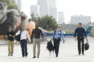
Costume - Half the characters are smart and the other half are casual. This emphasises how the movie is an action movie and how different types of characters unite to plot a bank robbery, hence the title "Takers"
Setting - This shot is taken in the middle of California. The use of a helicopter emphasises how the actors are in a wealthy and industrial area.
Props - The actors are holding duffle bags - this emphasises wealth.
Actors - Idris Elba and Chris Brown are the main actors in this shot. These actors are known for being in successful movies.

Wednesday, 16 September 2015

Film Poster Analysis.

Film Poster Analysis.


 Poster 1 - Blade Runner 
1. The poster suggests that the film is about a man who has the ability to create a robot. The story-line might be that the robot has a mind of its own and fights back against the human race.
2. The film genre might be a Sci-Fi/Action hybrid.
3. The target audience of this may be males and females of the age range 14-45.


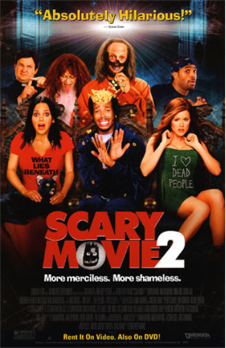
Poster 2 - Scary Movie 2 
1. The movie poster suggest that the group of friends are going to encounter scary things as the movie title and background suggest it.
2. The film genre might be a comedy/horror spoof.
3. The target audience of this may be males and females of the age range 14-36.


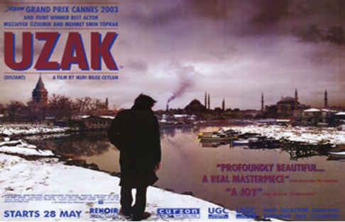
Poster 3 - UZAK
1. The poster suggests that the film is about a man in a poor eastern European country who encounters some troubles. The story-line might include insight into the man's personal life as he is faced to live in a poverty struck village.
2. The film genre might be an drama.
3. The target audience of this may be males and females of the age range 18-48


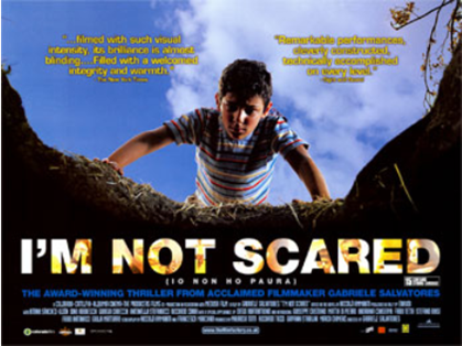
Poster 4 - I'm Not Scared
1. The poster suggests that the film is about a young boy's fight against his fears which he overcomes to solve the conflict. The story-line might involve an adventure underground or in wildlife. 
2. The film genre might be an thriller.
3. The target audience of this may be males and females of the age range 10-24.


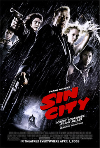
Poster 5 - Sin City
1. The poster suggests that the film is about a group of violent activists who have a significant amount of control over a city. The story-line may include themes such as violence, murder and death. this is shown by the gun in hand by the guy on the middle, middle left and the right.
2. The film genre might be a hybrid of crime and action.


3. The target audience of this may be males and females of the age range 14-30.


Poster 6 - Pirates of the Caribbean - Dead Man's Chest
1. The poster suggests that the film is about a group of pirates from the Caribbean who discover a lost pirates chest. The story-line may include that the protagonist(s) has/have to find the mysterious chest in search for treasure or supernatural discovery.
2. The film genre might be an adventure.
3. The target audience of this may be males and females of the age range 9-35.


Poster 7 - Bride & Prejudice 
1. The poster suggests that the film is about a bride's struggle to accommodate and fight against social prejudice. The storyline may be about the women who is trying to fight back against the old norms and values of society and show them that she is just as good as them (being the men).
2. The film genre might be a drama/romcom.
3. The target audience of this may be males and females of the age range 12-40.


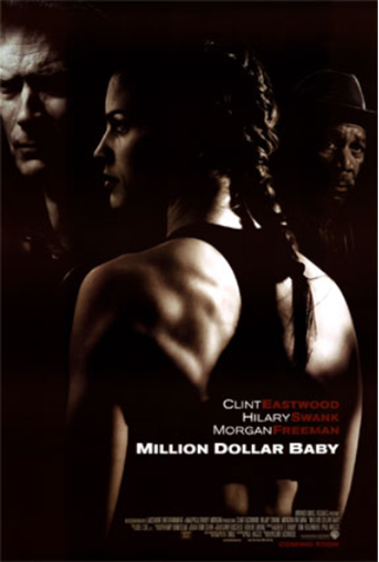
Poster 8 - Million Dollar Baby

1. The poster suggests that the film is about a woman who is in the middle of a conflict between the man on the left and the man on the right. The story-line could be about the action involved in the acquisition of the trust and company of this woman for financial purposes by the antagonists of the narrative.
2. The film genre might be a crime/drama.
3. The target audience of this may be males and females of the age range 16-35.